Creating a Revenue Report
The Revenue Report allows you to view the revenue generated by users who installed the app or opened a deep link during the set date range. Various metrics are available to create a customized report that will allow you to analyze your revenue data in depth.
The Revenue Report is available in [Reports]>[Revenue] on the Airbridge dashboard. Only the Owner or In-house Marketers have access to the Revenue Report.

The configuration box offers options for configuring the granularity, date range, Start Event, Revenue Event, Metric, GroupBy, and filter to create a customized report view that suits your needs.
Configuring a cohort in the Revenue Report allows you to analyze the revenue generated by a specific user segment. The cohort configuration is optional. Click Add to configure a cohort.
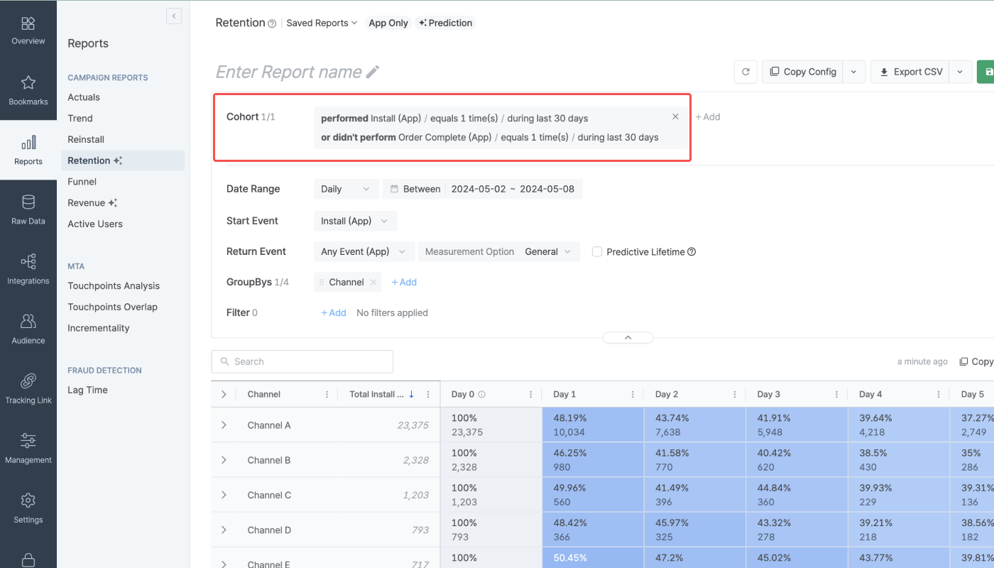
Read on to learn how to set up a cohort by configuring condition clauses.
Operator |
Description |
Option |
|---|---|---|
performed event | - Users who performed an event | App events |
didn't perform event | - Users who didn’t perform an event | App events |
where (had property) | - Non-event-related property of the users - Multiple properties can be added with “and” by clicking “+had property” | Property and value |
- Number of events performed by users | - Number of events performed by users | - equals - more than or equals - more than - less than or equals - less than |
when | - Time period the users performed the event - Can be set to max. 90 days - When using “between,” you can select from 2023-02-01 onwards - When using “during last,” you can decide whether to include “Today” or not | - during last - between - since |
You can use the following operators to add multiple condition clauses for a cohort.
Operator | Description |
|---|---|
or | Users who meet the aforementioned condition clause or the condition clause that follows |
and also | Users who meet the aforementioned condition clause and also meet the condition clause that follows |
and not also | Users who meet the aforementioned conditions but do not meet the condition that follows |
Let’s say you want to define a cohort as a group of iOS users who signed up for your service in March 2024. In that case, you may configure the cohort like in the image below.
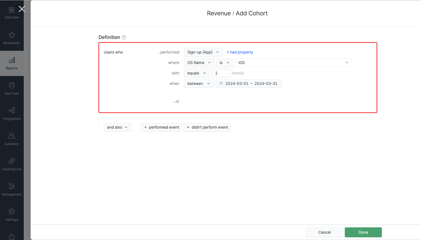
Let’s say you want to define a cohort as a group of iOS users who signed up for your service in March 2024 and also added an item to the cart at least once during the last 30 days, including today. In that case, you may configure the cohort like in the image below.

The Revenue Report displays the data in different time ranges depending on the granularity option selected in the configuration box. Each option comes with a maximum number of ranges that can be displayed in the report. Each time range is based on the Airbridge App Timezone.
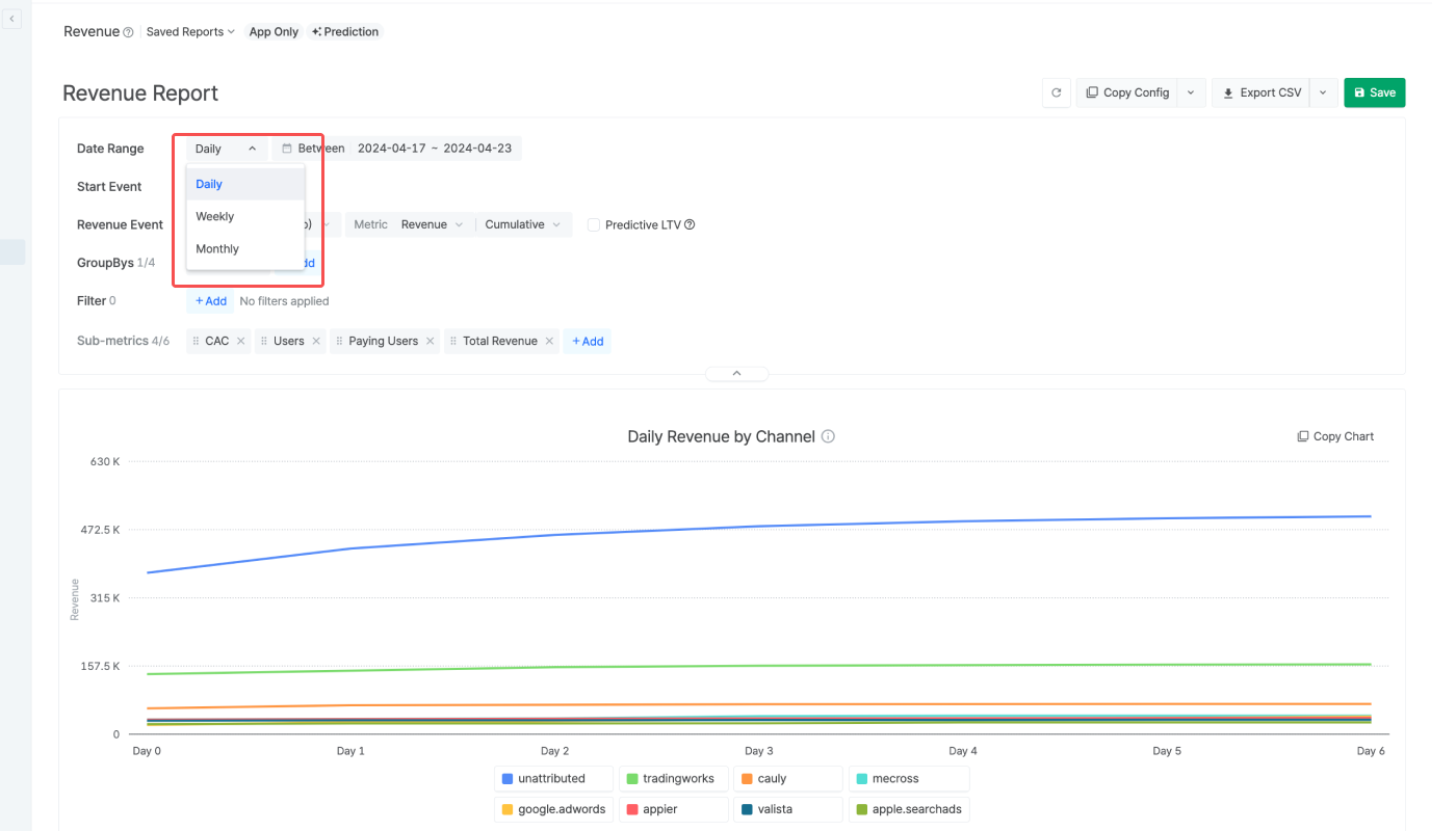
The following table indicates the maximum number of ranges that can show the retention data by granularity. The number of ranges displayed in the Retention Report depends on the set date range.
Granularity | Duration of a Range | Maximum No. of Ranges |
|---|---|---|
Daily | 1 Day (24 hours) | 181 Ranges (Day 0 ~ Day 180) |
Weekly | 1 Week, always starting from Monday | 53 Ranges (Week 0 ~ Week 52) |
Monthly | 1 Month, always starting from 1st day of the month | 37 Ranges (Month 0 ~ Month 36) |
Attention
Event data older than 180 days from the day of report creation will be displayed as Unattributed for Google Ads (google.adwords), Meta ads (facebook.business), and TikTok For Business (tiktok) to comply with their privacy policies.
The Revenue Report shows the revenue metric data of users who performed the Revenue Event during the set date range. Use the calendar filter to configure the date range.
Data older than 180 days from the day of report creation is available. The maximum date range configurable is 62 days, 12 weeks, or 3 months.
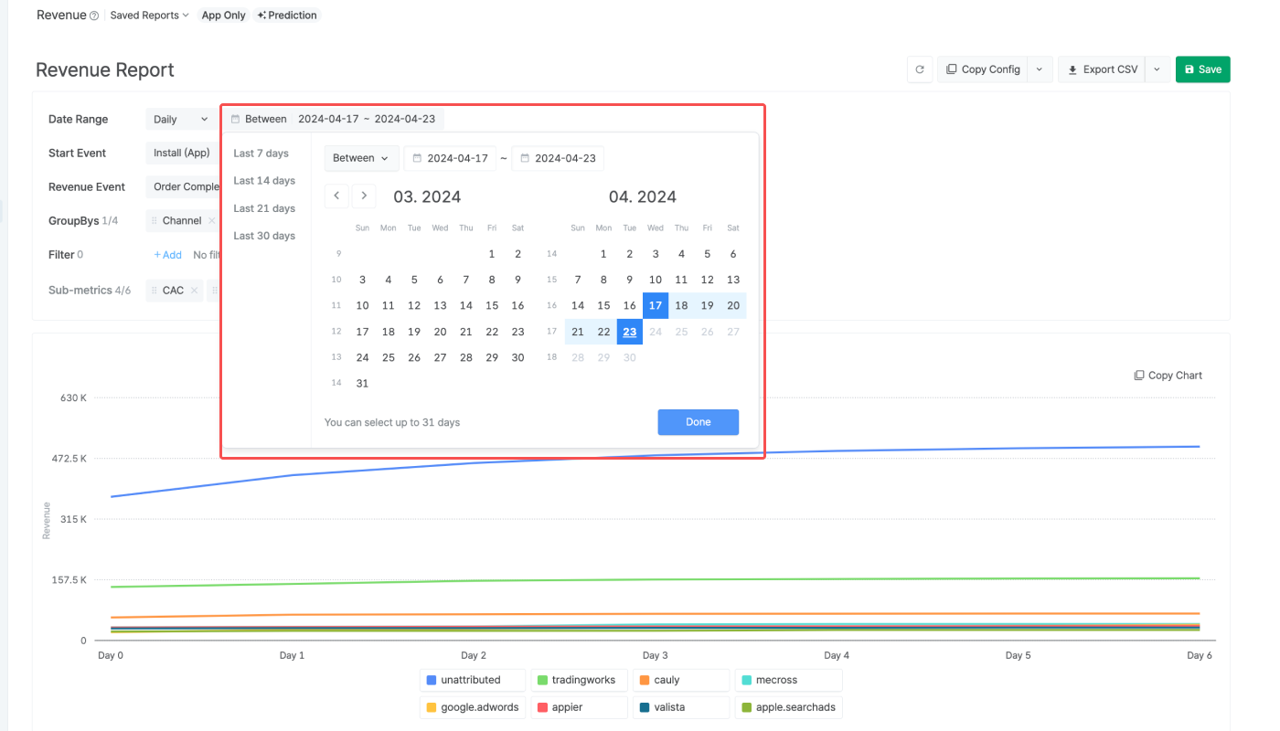
Refer to the following information when configuring the calendar filter.
The date range can be set using the following conditions.
Condition | Date Range |
|---|---|
Between | From start date to end date |
Since | From start date to today |
Last | Last n days/weeks/months until yesterday |
When using “Last,” options such as “Include today,” “Include this month,” and “Offset” can be added.
For example, if you select Last 30 days and add Offset + 3 days, the date range will start 33 days before today and end 4 days before today.
Data available in the Revenue Report
The Revenue Report only shows App event data; Web and iOS SKAdNetwork event data are not available.
The Revenue Report shows the revenue metrics of users who performed the Start Event and the Revenue Event.
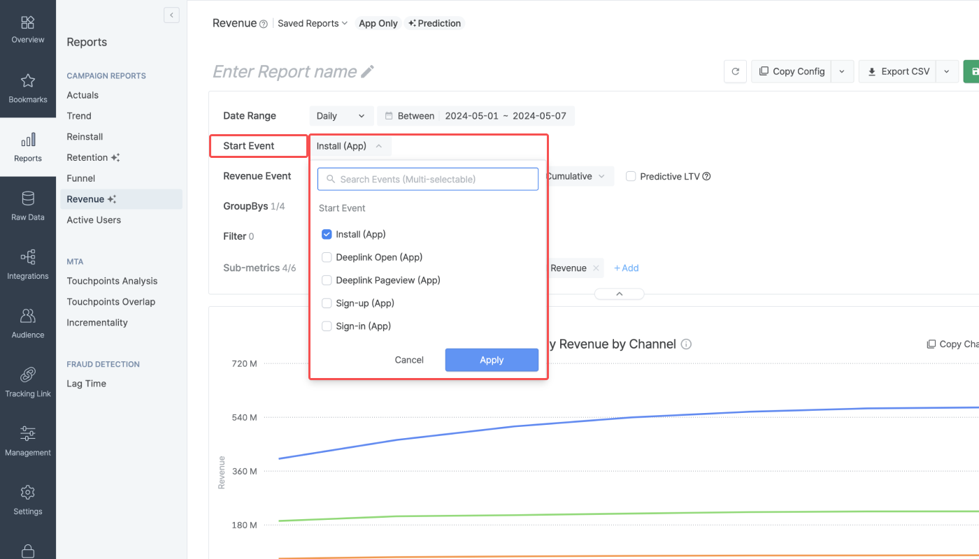
A Start Event is an event that is performed by the user who initiated the app engagement. Data of users who didn't perform the Start Event will be excluded from the reporting. Options for Start Event include Install (App), Deeplink Open (App), Deeplink Pageview (App), Sign-up (App), and Sign-in (App). Multiple Start Events can be selected. At least 1 Start Event must be selected to create a report.
For example, if Install (App) and Deeplink Open (App) are set as Start Events, the data of users who have performed an Install (App) event or Deeplink Open (App) event within the set date range will be aggregated.
The Revenue Event is the event performed by users who performed the Start Event and is closely related to the revenue generated by the user. The Revenue Event is aggregated up to 31 days (Day 30) from the day the user performed the Start Event.
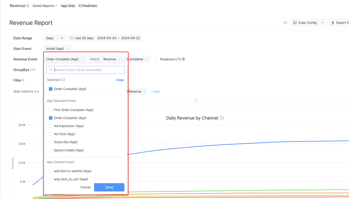
Standard Events and Custom Events can be set as Revenue Events, and up to 5 events can be set as Revenue Events.
Measure revenue generated by users who performed the Order Complete event.
First Order Complete (App)
Measure revenue generated via the first order completed by the user. The Airbridge Device ID is used to determine whether the order is the first order of a user or not.
Ad Impression (App)
Measure ad revenue generated via ad impression.
Ad Click (App)
Measure ad revenue generated via ad click.
Subscribe (App)
Measure revenue generated via paid subscription.
Spend Credits (App)
Measuere revenue generated via spend credits event.
When selecting a Custom Event as the Revenue Event, the event valuesof the Custom Event can be viewed in the report.
You can select a Custom Event without an event value, but in that case, the revenue metrics, such as Revenue, ARPU, and ARPPU, will show 0.
The Revenue Events are aggregated in different ranges depending on the chosen granularity.
When choosing "Daily," "Weekly," and "Monthly," the following options are available in the Day N selector for the Revenue Events to configure the number of ranges displayed in the Revenue Report.
Daily: Max. Day 30, Max. Day 60, Max. Day 90, Max. Day 180
Weekly: Max. Week 4, Max. Week 12, Max. Week 24, Max. Week 52
Monthly: Max. Month 3, Max. Month 6, Max. Month 12, Max. Month 36
Attribution process in the Revenue Report
The Revenue Event is considered the subsequent event of the Start Event that occurred most recently before the Revenue Event. If a new Start Event occurs, the previous Start Event can no longer claim the revenue generated by the Revenue Events. The last Start Event takes all the credit for the revenue generated by all Revenue Events that occur afterward.
This attribution process may cause a data discrepancy between the Revenue Report and the actual report.
The Revenue Report offers 6 revenue metrics to choose from. The revenue metric data will be made visible in the view type selected.

The available metric options and the calculation methods are described in the table below. To learn more about how the calculation methods differ by report settings, refer to the examples in this article.
Metric | Description | Calculation Method by View Type |
|---|---|---|
Revenue | Revenue generated by users who performed the Start Event during the set date range and performed the Revenue Event | Cumulative - Top row: The cumulative sum of the revenue generated during the set date range - Sub-row: The cumulative sum of the revenue generated by users who performed the Start Event on the set date range of the sub-row Non-Cumulative - Top row: The sum of the revenue of the sub-rows - Sub-row: The revenue of the set date range of the sub-row |
User Count | The number of users who performed the Revenue Event after performing the Start Event during the set date range | Non-Cumulative - Top row: The sum of the unique users in the sub-rows - Sub-row: The number of users who performed the Revenue Event during the set date range of the sub-row |
Event Count | The number of Revenue Events performed by users who performed the Start Event during the set date range | Cumulative - Top row: The cumulative sum of the number of Revenue Events performed during the set date range - Sub-row: The cumulative sum of the number of Revenue Events performed on the set date range of the sub-row Non-Cumulative - Top row: The sum of the number of Revenue Events in the sub-rows - Sub-row: The number of Revenue Events performed during the set date range of the sub-row |
ROAS | The return on ad spend based on the revenue generated by users who performed a Revenue Event after performing the Start Event during the set date range | Cumulative - Top row: Sum of {(Weighted value of the daily Total Cost)) * (ROAS in sub-row)} - Sub-row: (Cumulative revenue generated) / (Total Cost of the sub-row) * 100 |
ARPU | The average revenue per user based on the revenue generated by users who performed the Start Event during the set date range and performed the Revenue Event | Cumulative - Top row: Sum of {(Weighted value of the daily Total Users) * (ARPU in sub-row)} - Sub-row: (Cumulative sum of the revenue amount) / (Total Users in the sub-row) |
ARPPU | The average revenue per paying user based on the revenue generated by users who performed the Start Event during the set date range and performed the Revenue Event | Cumulative - Top row: Sum of {(Weighted value of daily Total Paying Users) * (ARPPU in sub-row)} - Sub-row: (Cumulative sum of the revenue amount) / (Total Paying Users in the sub-row) |
PUR | The paying user rate based on the number of users who performed a Revenue Event after performing the Start Event during the set date range | Non-Cumulative - Top row: Sum of {(Weighted value of daily total users) * (PUR in sub-row)} - Sub-row: {(The number of paying users in the sub-row) / (The number of total users in the sub-row)}* 100 Cumulative Unique - Top row: Sum of {(Weighted value of total users) * (PUR in sub-row)} - Sub-row: {(Cumulative sum of the number of paying users) / (The number of total users in the sub-row)} * 100 |
The metric is displayed differently depending on the view type you select.
When selecting "Cumulative" as the view type, the Revenue Report displays the running sum of all metric data calculated up to Day N. Therefore, the revenue amount displayed for the last day is equal to the total revenue amount.
Metrics that support the "Cumulative" view type: Revenue, Event Count, ROAS, ARPU, ARPPU
Example
Let’s say the view type is set to "Cumulative," and the following data is displayed.
Cumulative |
Day 0 |
Day 1 |
Day 2 |
Day 3 |
|---|---|---|---|---|
Revenue | 10 | 20 | 60 | 80 |
The revenue displayed for Day 2, which is 60 USD, is the sum of the revenue generated from Day 0 to Day 2. Therefore, the revenue generated on Day 2 alone is 40 USD, which is the difference between the revenue displayed for Day 2 and Day 1.
When switching the view type to "Non-Cumulative," the same data will be displayed, as shown in the following table.
Non-Cumulative |
Day 0 |
Day 1 |
Day 2 |
Day 3 |
|---|---|---|---|---|
Revenue | 10 | 10 | 40 | 20 |
When selecting "Non-Cumulative" as the view type, the Revenue Report displays only the metric data for Day N.
Metrics that support the Non-Cumulative view type: Revenue, Event Count, User Count, PUR
Example
Let’s say the view type is set to "Non-Cumulative," and the following data is displayed.
Non-Cumulative |
Day 0 |
Day 1 |
Day 2 |
Day 3 |
|---|---|---|---|---|
Revenue | 10 | 20 | 60 | 80 |
The revenue for Day 2, which is 60 USD, is the revenue generated on Day 2. The revenue for Day 3, 80 USD, is the revenue generated on Day 3 alone.
When switching the view type to "Cumulative," the same data will be displayed, as shown in the following table.
Cumulative |
Day 0 |
Day 1 |
Day 2 |
Day 3 |
|---|---|---|---|---|
Revenue | 10 | 30 | 90 | 170 |
When selecting "Cumulative Unique" as the view type, the Revenue Report displays the sum of unique values up to Day N.
Metrics that support the "Cumulative Unique" view type: User Count, PUR
Example
Let’s say the view type is set to "Cumulative Unique," and the following data is displayed.
Cumulative Unique |
Day 0 |
Day 1 |
Day 2 |
Day 3 |
|---|---|---|---|---|
User Count | 100 | 200 | 600 | 800 |
The user count of Day 2, which is 600, is the sum of the unique users who performed the Revenue Event from Day 0 to Day 2.
Note that the difference between the Day 2 User Count and Day 1 User Count, 400, should not be interpreted as the number of unique users who performed the Revenue Event on Day 2; the Day 2 User Count, 600, is the sum of the unique users who performed the Revenue Event at least once between Day 0 to Day 2.
If you want to view the number of unique users who performed the Revenue Event on Day 2, select "Non-cumulative" as the view type.
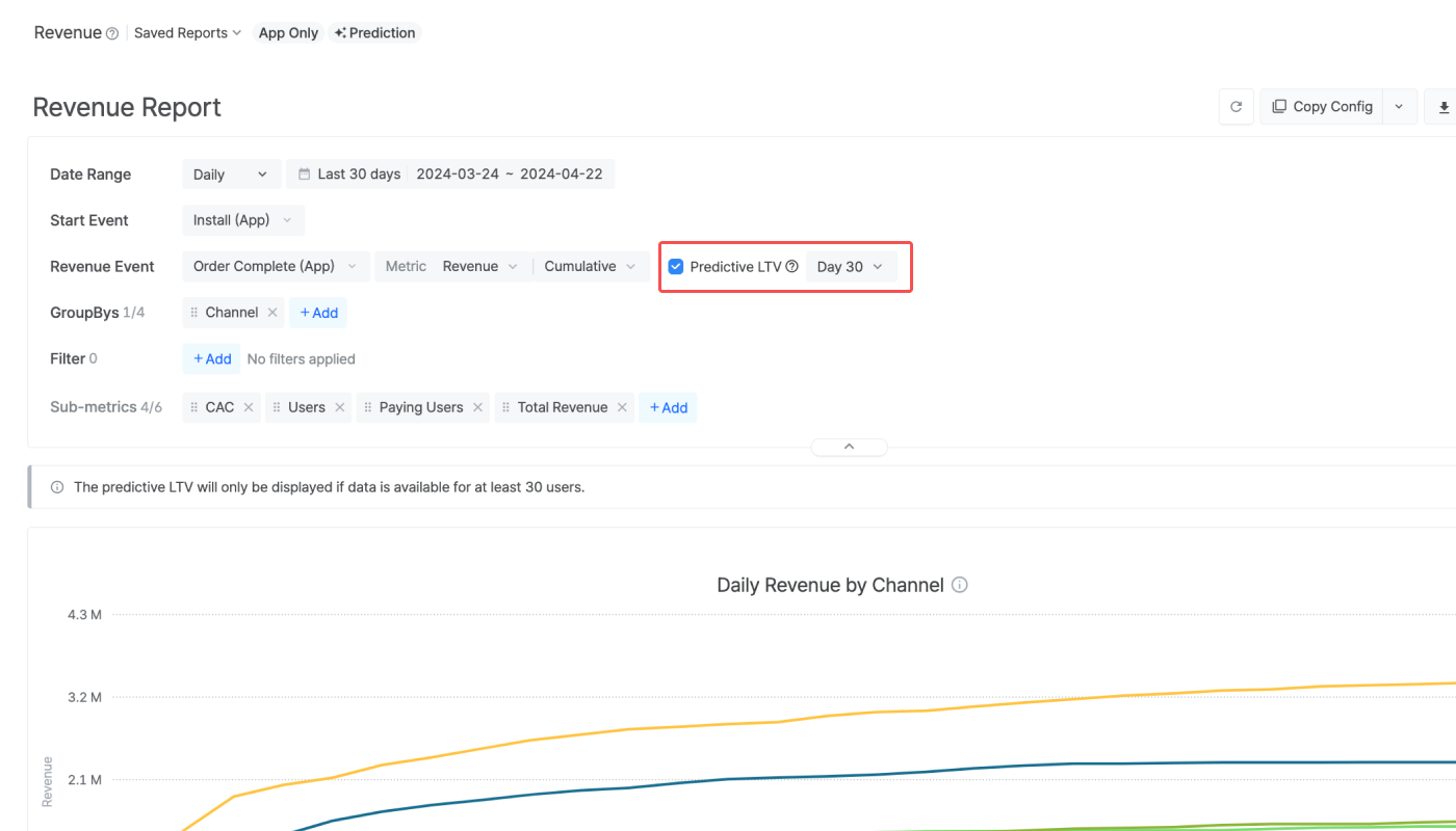
You can enable the predictive lifetime value (pLTV) in the report by clicking the checkbox and selecting the calculation period from the drop-down menu. By enabling the pLTV feature, you can view the predictive revenue amount that is expected to be generated from your service. For more details about the pLTV, refer to this article.
Attention
All values displayed in the Revenue Report with the GroupBy and Filter options applied are based on users who performed the Start Event.
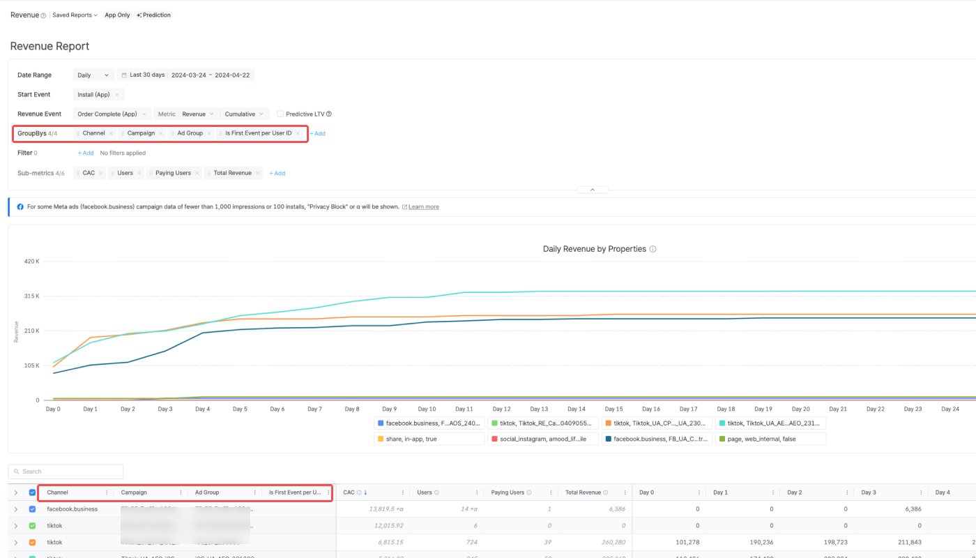
GroupBys are used to split the metric data into groups. Up to 4 GroupBys can be selected. You can rearrange the order of the GroupBys by dragging the GroupBy chips. Refer to this article to learn about the GroupBy options that are available.
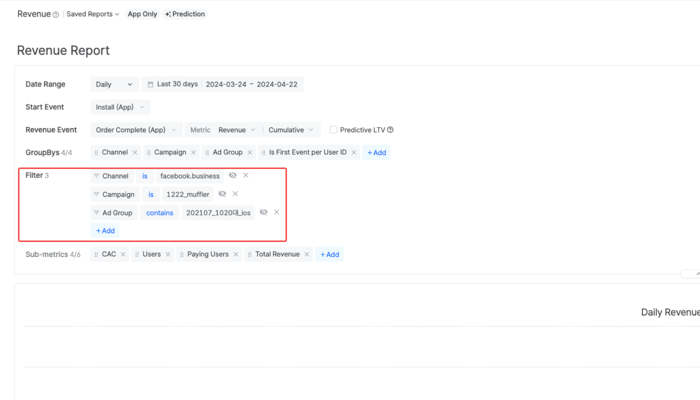
Filters can be configured to display specific data in the chart and table. To configure a filter, select the filter option, operator, and value.
A sub-metric is an additional metric you can select to display on the report. The Revenue Report supports the following 6 sub-metrics.
Sub-metric |
Description |
|---|---|
Users | The number of users who performed the Start Event. Some Meta ads data may be masked until you have accepted Meta’s Advanced Mobile Measurement Terms. |
CAC | The total customer acquisition cost divided by the number of users who performed the Start Event |
Paying Users | The number of users who performed the Start Event and the Revenue Event |
Total Revenue | The total revenue generated by the users who performed the Start Event and the Revenue Event |
Total Cost | The total cost spent to acquire users who performed the Start Event. This sub-metric is automatically selected when ROAS is chosen as the revenue metric. |
Total Event Count | The total number of events performed by the users who performed the Start Event and the Revenue Event. This sub-metric is automatically selected when Event Count is chosen as the revenue metric. |
Note
To gain full visibility of your Meta ads campaign data in Airbridge reports, you need to accept Meta’s Advanced Mobile Measurement (AMM) Terms. Otherwise, Meta ads campaign data remains masked in Airbridge. For more information about Meta's AMM terms, refer to this article.
When selecting a metric, 3-4 sub-metrics are automatically selected. The sub-metrics can be added or deleted like the metrics. The sub-metric data are made available in fixed columns in the table.

The Revenue Report displays the revenue metric data at the chosen granularity in charts and tables. The revenue data will be displayed in the App Standard Currency. For details about the calculation methods used in the Revenue Report, refer to this article.
Note
Starting February 4, 2025, the Overview Dashboard, Actuals Report, Trend Report, Retention Report, Revenue Report, Active Users Report, and Audience Manager will only display events and metrics measurable using the collected data.
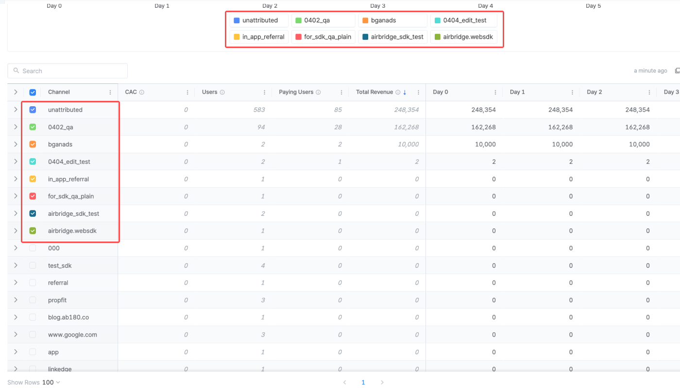
The Revenue Report displays the metric data in a line chart, with the data series visualized in different colored lines. By default, 8 datasets identified with the top total revenue appear on the chart. You can add or remove specific datasets from the chart by checking or unchecking the checkboxes next to the dataset names in the table.
You can add or remove specific datasets from the chart by clicking on the legend labels.
When hovering over the chart, you can view the data labels that identify the specific data points.

To view the value of a specific data point, hover over a specific data point.
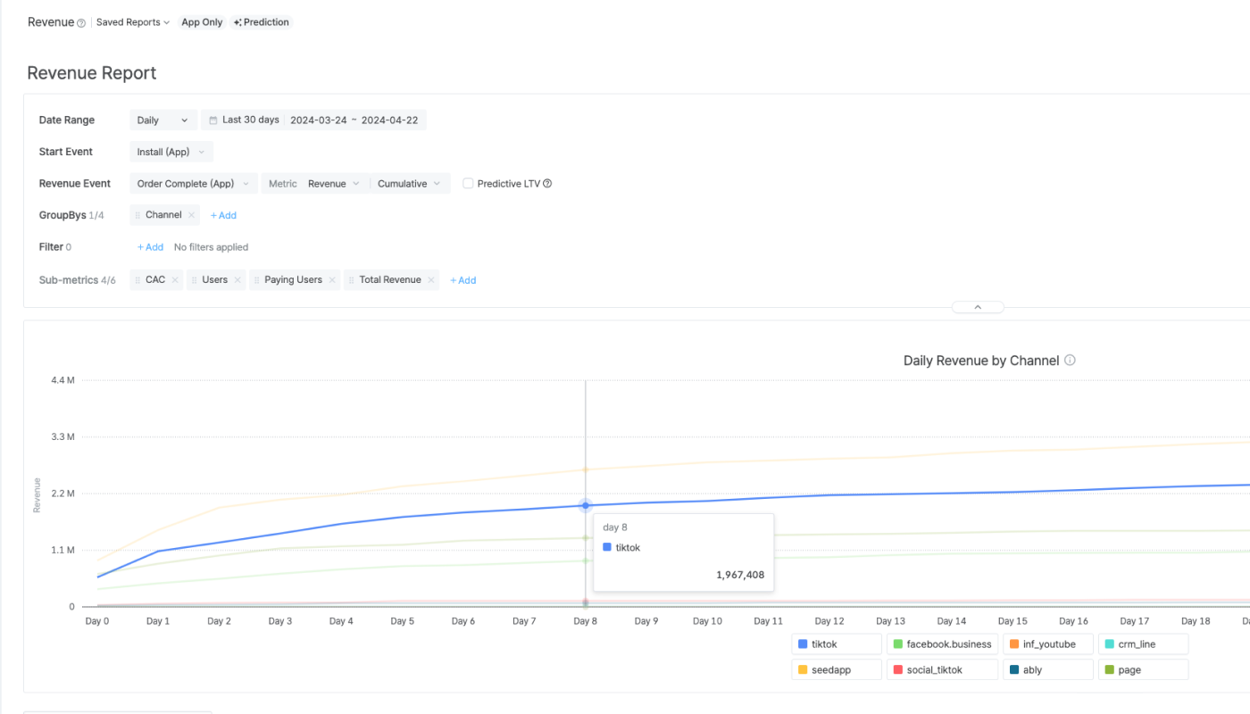
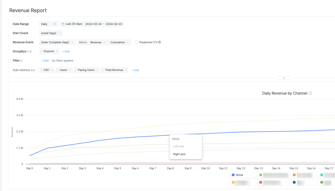
When the values vary widely among the data series, you can add a secondary axis to the chart to improve its readability. Click on a data point of the data series you want to add a secondary axis to and select Right axis. The right axis appears, and the axis labels will accommodate the selected data series for improved readability.
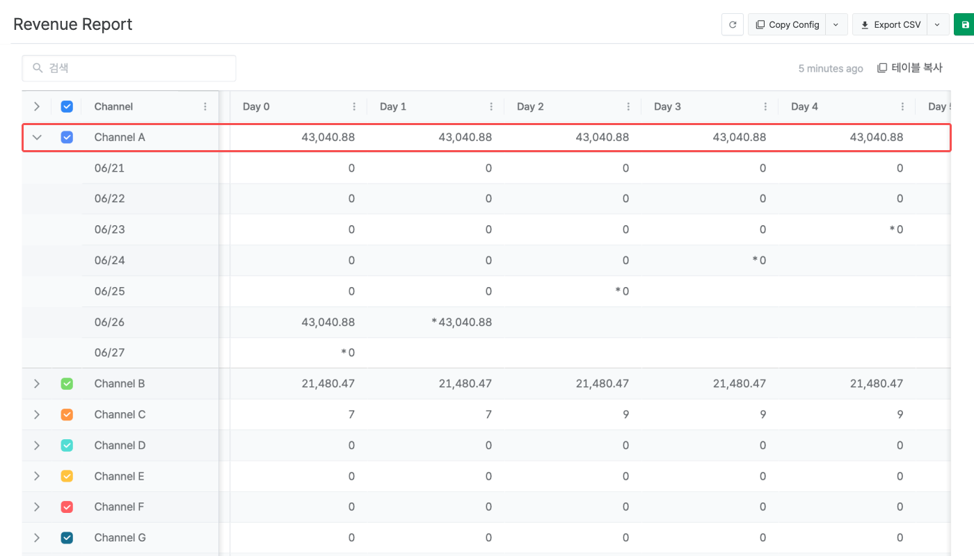
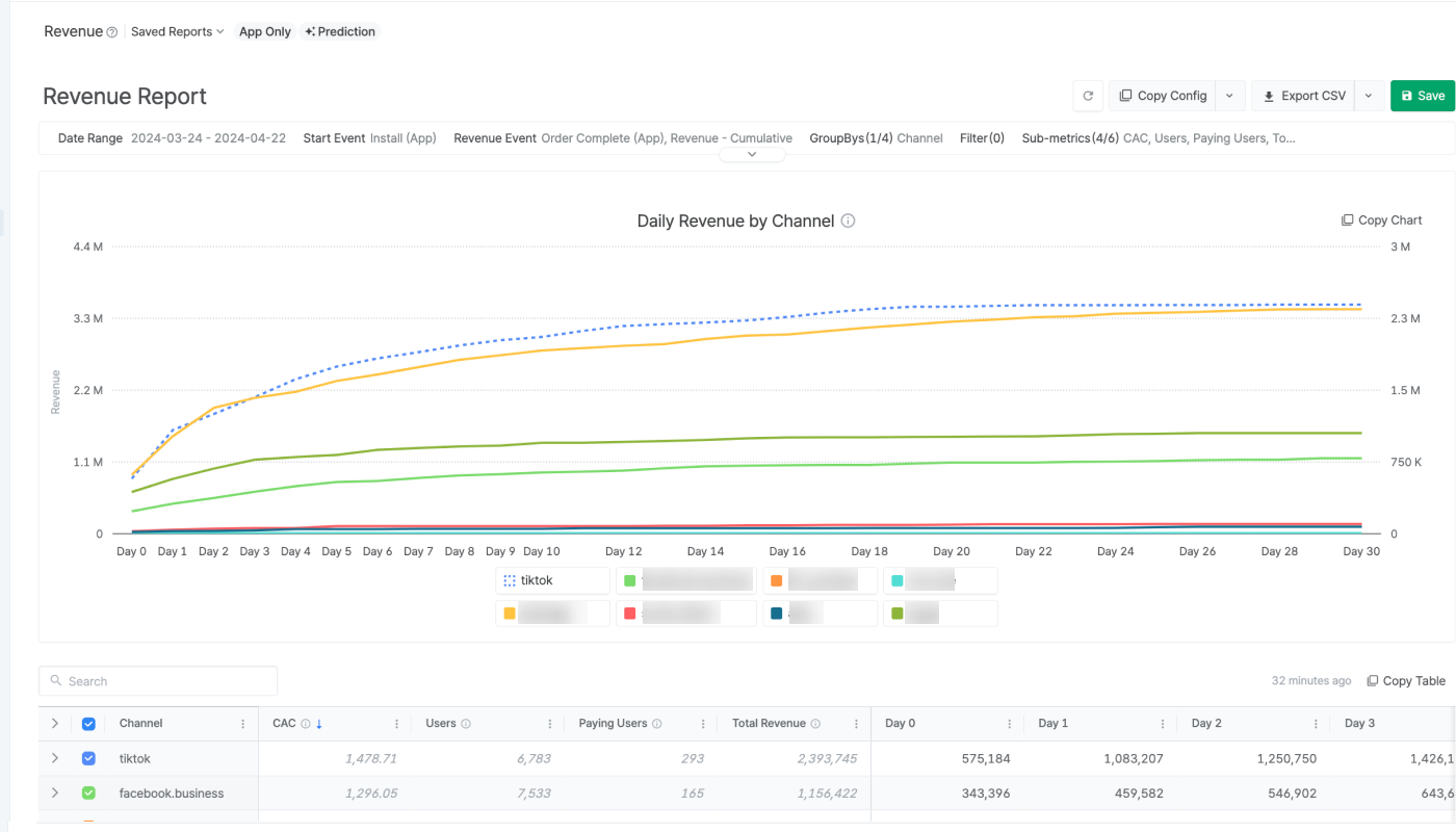
For example, if Channel A's metric data is significantly smaller than the metric data of other Channels, the trend of Channel A's data isn’t easy to track in the chart. When adding the right axis for Channel A’s metric data, the Channel A data will be visualized in dotted lines, and the right axis labels will be set for a better understanding of the Channel A data.
By default, 8 datasets identified with the top total revenue appear in the chart. From the table, you can check or uncheck the checkboxes next to the dataset names to add or remove the data from the chart. Click the top checkbox to check or uncheck all 8 datasets at once.
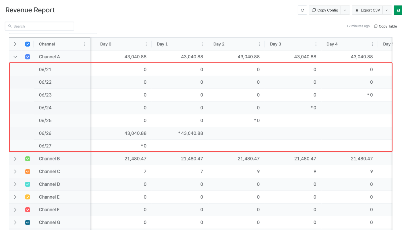
The table shows the sub-metric data and the metric data by the set granularity (Day N, Week N, Month N).
Airbridge reports support various features, from saving reports to sharing them with others.
The table shows the general features supported by Airbridge reports. Some features are not available in certain reports.
Feature |
Description |
|---|---|
Refresh | Reload data with the existing report configuration. The time passed since the time the data was loaded appears next to the Refresh button or Copy Table button. |
Wide controls | Configure the report on a wider panel. |
Search | Search the report by keywords. |
Expand/Collapse | Expand or collapse the configuration box. |
Report naming | Name the report and save it for later use. |
Refer to the table below to learn how to share your report with others.
Feature |
Description |
User Guide |
|---|---|---|
Copy Config | Click Copy Config to share the report with other Airbridge users regardless of their app roles and access settings. | |
Share Report URL | The Report URL is the URL assigned to each Airbridge report. By sharing the report URL with other Airbridge users with the same access level as yours, you can share the same report view. | |
Grant App Access | Invite users to the Airbridge App and assign app roles. The data users can access depends on their app roles. | |
Copy Table | Click Copy Table and paste the table into a spreadsheet or a messenger. | |
Export CSV | Export the report as a CSV file or a Google Spreadsheet file. | |
Use Sharelinks | Sharelinks are URLs where anyone can download a CSV file that contains the Actuals Report data without accessing the Airbridge dashboard. The data shared through the Sharelink is the data that is accessible with the app role of the Airbridge user who created the Sharelink. |
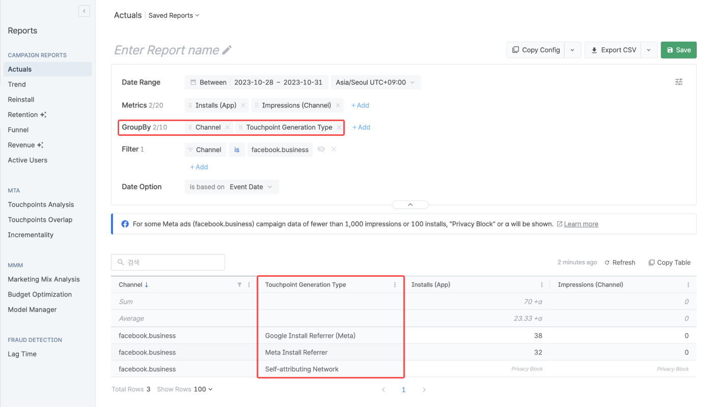
根据 Meta 的隐私保护政策,在 Airbridge 报告中设定的日期范围内发生的部分 Meta ads 数据将被掩盖。
Meta ads 通过 渠道集成 或 成本集成 提供的数据中(其 Touchpoint Generation Type 显示为 Self-attributing Network),在以下情况下将发生数据掩盖:
通过 Meta ads 广告系列产生的 Impression 和 Engaged-view 的总和为 1,000 以下
归因于 Meta ads 的 App 安装为 100 以下
被掩盖的数据不会汇总到 Airbridge 报告中。 根据报告设置,数据将按以下方式显示:
标记 | 条件 | 说明 |
|---|---|---|
Privacy Block | 掩盖所有符合报告设置的数据 | 用于代替数值显示 |
+α, ±α | 符合报告设置的数据中,仅掩盖部分数据 | 附在数值后显示 |
更改报告设置可能会允许显示被掩盖的数据。您可以尝试:
更改或延长日期范围。
更改或移除部分分组或筛选条件。
不掩盖的数据
除渠道集成和成本集成外,以其他方式收集的 Meta ads 数据,如通过 Install Referrer 的, 不会被掩盖。您可以在基础报告将 Touchpoint Generation Type 设置为分组条件,按触点生成类型查看数据。Install Referrer 数据的 Touchpoint Generation Type 将显示为 Meta Install Referrer 或 Google Install Referrer (Meta)。
The table below outlines the features and limitations of the Revenue Report.
Supported features and limitations |
Description |
|---|---|
No. of configurable Revenue Events | 5 |
No. of GroupBys configurable | 6 |
Self-serve Metrics, Calculated Metrics, Custom GroupBys | Not supported |
Timezone | The configured App timezone |
Currency | The configured App standard currency |
Data visualized in | Tables, charts |
Data refresh cycle | 1 hour |
Aggregated data | App event data, cost data |
Custom events | Supported |
Maximum no. of rows in the Airbridge dashboard | 10,000 rows |
Maximum no. of rows in the CSV file | 10,000 rows |
Data available of | Past 5 years (2023-02-01 and onwards) |
Maximum date range configurable for a single report view | 31 days |
Was this helpful?
